Mailchimp Data Visualization
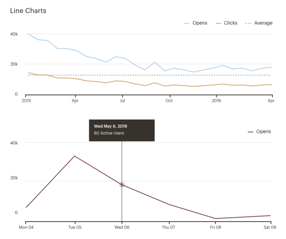
One of my first projects at Mailchimp was to help redefine our visual guidelines for how we present data. I worked with our design system Product Designer and infrastructure Staff Engineer.
For this deliverable, our goals were to:
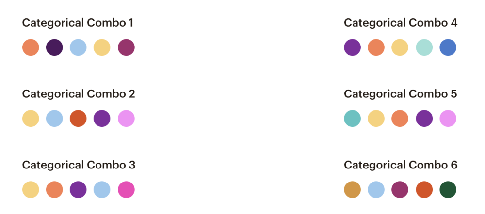
Provide a number of color combinations with appropriate color contrast (in both Figma and code).
Publish first phase of our refactored charts from Dojo to React D3.

Defining Color Combinations
We did not have design guidelines on using color within our charts. Color combination decisions were typically left up to product teams. With our large selection of brand colors, this introduced potential issues that could make our visualizations inaccessible to users with color blindness or low-vision.
At the time of the project, we still had various way to implement charts in the codebase so we made the color combinations accessible through 1) Less tokens and 2) class names. Our tokens were combination names set up as an array of values. We then took those tokens and created a recursive mixin to generate the CSS class names.

Refactoring to React D3
Our charting system was originally built in Dojo mixed with various charting libraries. This project was the first phase of refactoring charts from Dojo to React D3.